The art of VISUAL storytelling
Infographics turn complex ideas into clear, compelling visuals that grab attention and stick. By blending data, design, and storytelling, they make content more engaging, memorable, and shareable. Ideal for blog posts, social media, and campaigns, infographics simplify stats, spotlight trends, and elevate brand messaging — making your content stand out in a crowded digital space.
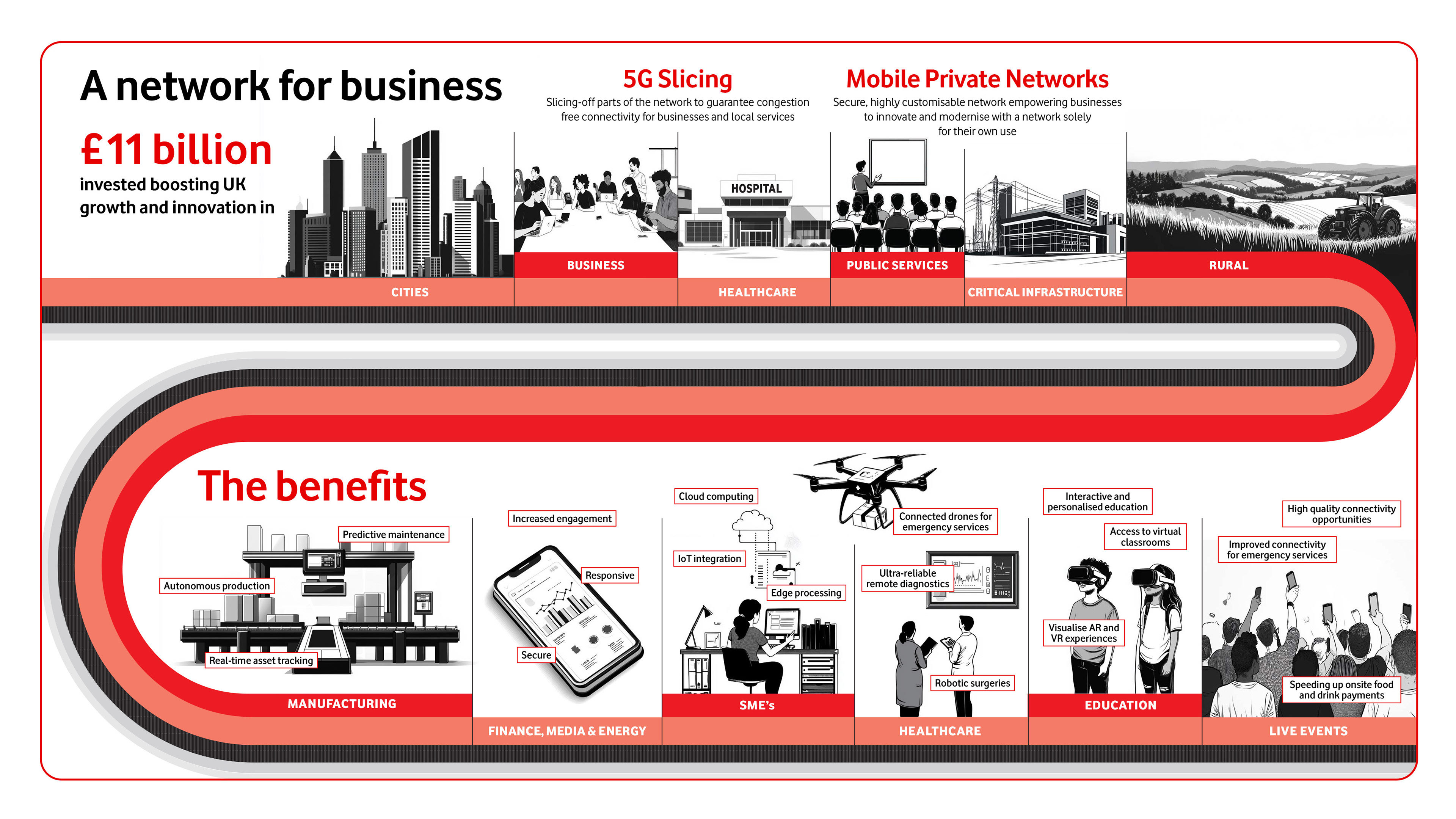
The VodafoneThree infographics highlight a bold transformation in UK connectivity, showcasing major milestones like the £11 billion investment, 5G Standalone rollout, and expanded Full Fibre access.
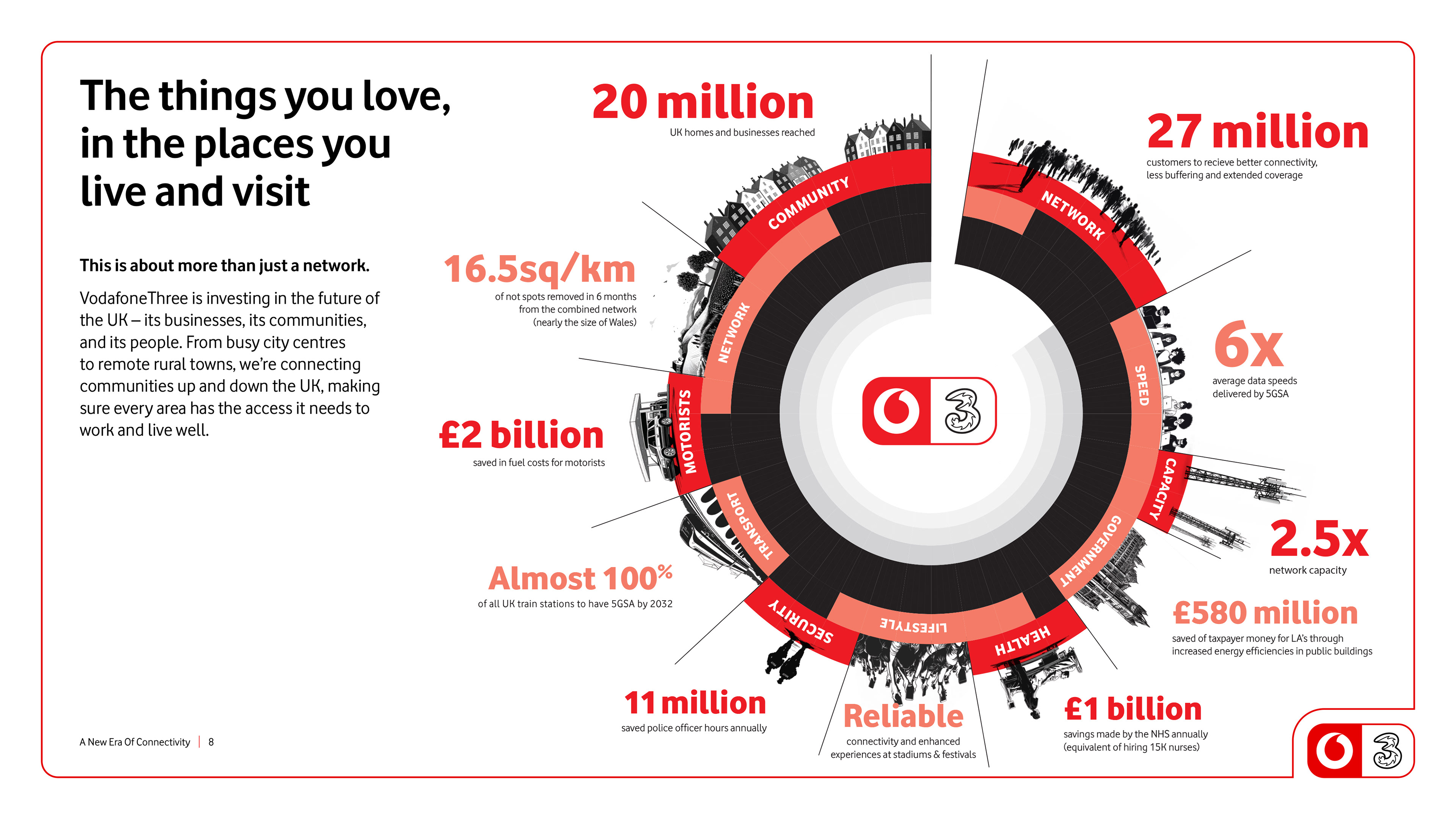
They visually communicate the merger’s impact across communities, businesses, and public services — emphasising faster speeds, broader coverage, and meaningful social and environmental benefits.
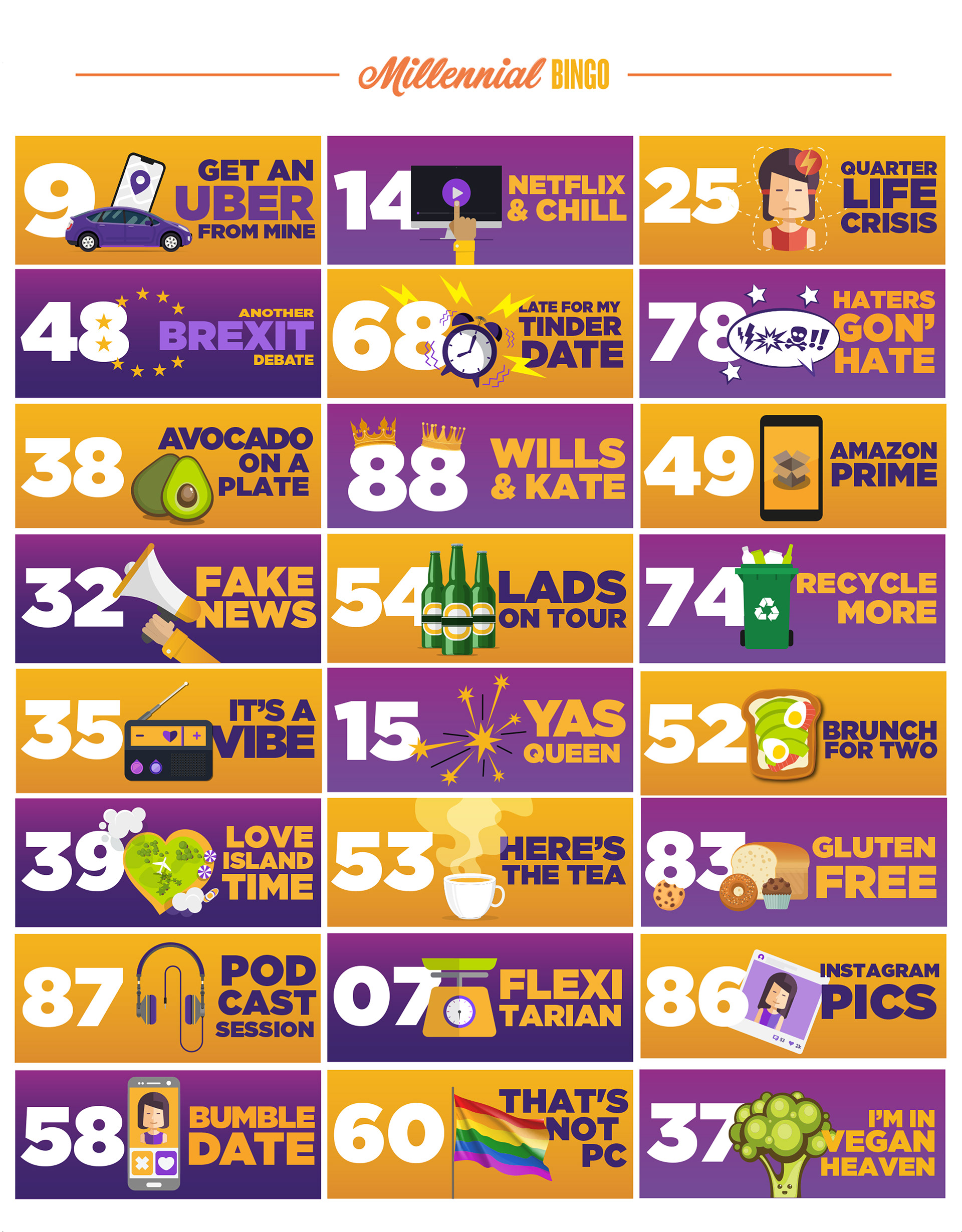
Foxy Bingo refreshed traditional bingo calls for a younger audience, inspired by players’ pop culture references like “68, late for my Tinder date.” The brand invited users to vote on new calls, launching a playful illustration campaign that captured media attention nationwide—earning standout coverage including ITV and an impressive ROI of 76:1.
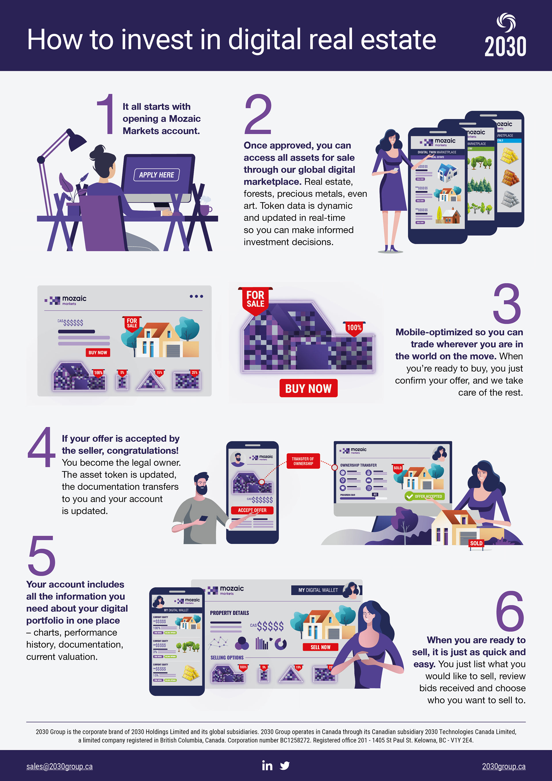
The 2030 Group infographics introduce a new way to buy, sell, and invest in digital real estate through Mozaic Markets. The first infographic explains how users can create a “digital twin” of their property — digitising key information into tradable data blocks and enabling fractional ownership.

This infographic showcases the evolution of bikini styles — from modest silhouettes to rebellious cuts — highlighting how fashion reflects personal expression, cultural shifts, and changing attitudes toward body confidence.

Avis created a vibrant infographic road map to inspire travel across Great Britain. Designed to spark wanderlust, the visual guide highlights iconic destinations for adventurers to plan memorable journeys from coast to countryside.

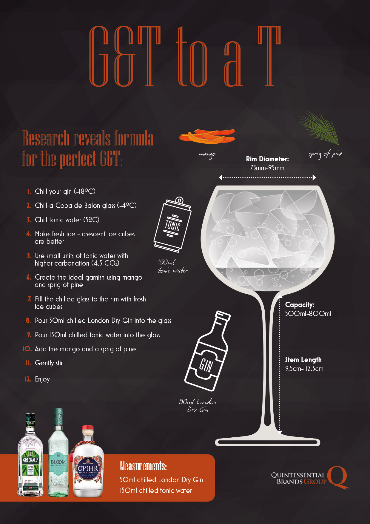
Aldi designed a playful infographic to help shoppers craft the perfect gin and tonic, spotlighting key ingredients, garnishes, and pairing tips. The visual guide celebrates flavour and simplicity, making it easy for anyone to mix a refreshing G&T at home.
An infographic can powerfully showcase the key reasons to invest in Prosperity Parc, distilling complex data into a clear, visual story. By highlighting its 230-acre scale, direct port access, high energy capacity, and Freeport incentives, the infographic makes the site’s strategic advantages instantly digestible.

Epson’s infographic on sustainable printing in education highlights how schools can reduce their environmental impact by switching from traditional laser printers to heat-free inkjet technology. It visually breaks down benefits like lower energy consumption, reduced waste, and cost savings.

A detailed infographic explaining GSK’s asbestos management plan that visually outlines the company’s approach to identifying, assessing, and safely managing asbestos risks across its facilities.

The Our World infographic created for Rolls Royce presents a sweeping visual overview of global change, from population growth and urbanisation to climate action and technological progress. It highlights key trends shaping our future, including rising middle-class economies, shifting workforce skills, and the impact of digitalisation.